
DTF Halftone Software and Photoshop Guide: Settings, Testing, and Troubleshooting
Jul 15, 2026
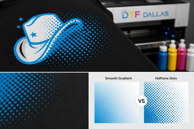
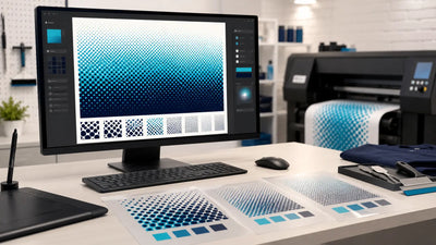
DTF halftones can be created in Photoshop, Illustrator, browser-based tools, and DTF-specific software. The best option depends on whether you need manual control, editable vector artwork, automated cleanup, or a faster print-ready workflow.
No software can replace clean artwork and physical testing. A halftone that looks smooth on a monitor may behave differently after printing, powdering, curing, pressing, and washing. The most reliable approach is to test controlled variations with the same production conditions used for real orders.
What Is the Best Software for DTF Halftones?
The best DTF halftone software is the tool that fits the artwork and production workflow. Photoshop offers detailed raster control, Illustrator is useful for editable vector effects, and DTF-specific tools can automate transparency cleanup, previews, and print-ready export.
A practical comparison looks like this:
| Software Type | Best For | Main Limitation |
|---|---|---|
| Photoshop | Raster artwork, gradients, photos, and manual control | More manual steps |
| Illustrator | Editable vector halftones and scalable graphics | Final raster export still needs testing |
| DTF-specific tools | Faster cleanup, previews, and automation | May offer less manual control |
| Browser-based tools | Simple jobs and quick conversions | Limited masking and detailed editing |
The software matters, but the exported file matters more. A useful tool should allow you to:
- Work at the final print size
- Remove unwanted transparency
- Control frequency, angle, and dot shape
- Preserve text and logos as solid elements
- Export a print-ready file
- Compare controlled test versions
Is Photoshop Good for DTF Halftones?
Photoshop is a strong choice for DTF halftones because it provides direct control over raster artwork, selections, tonal areas, transparency, and halftone screen settings.
It is especially useful for designs that include:
- Photographs
- Gradients
- Shadows
- Smoke effects
- Distressed textures
- Raster illustrations
- Soft tonal transitions
Photoshop's Bitmap Halftone Screen process includes controls for output resolution, frequency, angle, and dot shape. Cleanup tools such as Color Range, Smooth, and Defringe can also help isolate tonal areas and remove edge contamination before the halftone is created.
The main drawback is that the workflow is manual. The user must decide which areas should be halftoned, which details should remain solid, and which settings are worth testing.
Is Illustrator Good for DTF Halftones?
Illustrator is useful when the original artwork is vector-based and the halftone effect needs to remain editable.
It can work well for:
- Logos with tonal effects
- Geometric artwork
- Scalable illustrations
- Controlled dot patterns
- Designs that need several size variations
The final DTF file may still need to be rasterized or exported into a format supported by the RIP workflow. Always review the exported version at the actual print size because a clean vector effect can change when converted to pixels.
What Do DTF-Specific and Browser-Based Tools Do?
DTF-specific tools can speed up production by combining halftone generation with transparency cleanup, previews, color knockouts, resolution checks, and print-ready export.
Browser-based tools can be useful for simpler designs and quick conversions. They may be enough for basic faded graphics, but detailed photo artwork and critical brand elements often need the extra masking and layer control available in Photoshop or Illustrator.
Automation saves time, but it does not remove the need for review. A tool may erase small details or create dots that are too delicate for the actual printer and press workflow.
How Do You Create Halftones in Photoshop for DTF?
Create a DTF halftone in Photoshop by finalizing the artwork size, cleaning unwanted transparency, isolating the tonal area, converting that area into a controlled dot pattern, restoring critical elements as solid artwork, and exporting the file for physical testing.
1. Set the Final Print Size
Build the artwork at the size it will actually be printed.
A halftone that works at 12 inches wide may not behave the same when reduced to 3 inches. Reducing the design can make dots too small, while enlarging it can make the pattern look coarse.
Confirm:
- Final width and height
- Intended garment placement
- Raster resolution
- Transparent background
- Color mode required by the RIP
2. Clean Unwanted Transparency
Inspect the file before creating the halftone.
Look for:
- Faint background residue
- White or dark fringe
- Low-opacity edge pixels
- Stray pixels
- Soft selections around removed backgrounds
- Semi-transparent contamination
Photoshop tools such as Color Range, Smooth, and Defringe can help clean problem areas. Halftoning dirty artwork does not remove edge contamination. It can turn the contamination into a visible dot pattern.
3. Isolate the Tonal Areas
Select only the parts of the artwork that need a halftone, such as:
- Gradients
- Shadows
- Smoke
- Faded edges
- Distressed textures
- Photo shading
- Large tonal backgrounds
Text, QR codes, thin outlines, and small logos should usually remain separate and solid.
4. Prepare the Tonal Range
The selected area may need to be converted into grayscale or prepared as a high-contrast tonal image before creating the halftone.
In simple terms, the artwork needs enough contrast to form visible dots without losing light or dark detail. If the tonal range is too flat, the result may look muddy. If it is too aggressive, highlights may disappear and shadows may fill in.
5. Apply the Halftone Screen
Photoshop's halftone process allows control over:
- Output resolution
- Frequency
- Angle
- Dot shape
Change one variable at a time. If frequency, angle, dot shape, and contrast all change together, it becomes difficult to identify which adjustment improved or damaged the result.
6. Restore Solid Text and Logos
Place edge-critical elements back into the design as solid artwork after the tonal areas have been halftoned.
This protects:
- Text readability
- QR code scanning
- Logo clarity
- Fine outlines
- Small symbols
- Crisp borders
A design can contain both halftoned and solid elements. In many cases, that mixed structure performs better than converting the entire file into dots.
7. Review the Artwork at Actual Size
View the design at 100 percent and inspect:
- The smallest dots
- Spacing between dots
- Edge cleanliness
- Text clarity
- Tonal balance
- Background transparency
Do not judge only from a highly zoomed-in preview. The design must work at the physical size used for printing.
8. Export a Print-Ready File
Transparent PNG is a common handoff format for DTF artwork. TIFF or PDF may also be used when supported by the production workflow.
Before export, confirm:
- Final dimensions
- Resolution
- Transparent background
- Clean edges
- Solid critical details
- No hidden unwanted layers
- No unintended semi-transparent residue
A file is not truly production-ready until it has been tested through printing, pressing, and washing.
What DPI Should You Use for DTF Halftones?
A practical starting point for DTF halftone artwork is 300 DPI at the final print size. Higher resolution does not automatically improve the transfer if the original artwork lacks detail or the smallest dots cannot survive printing and pressing.
The phrase "at the final print size" matters.
A 300 DPI file created at 12 inches wide contains more useful detail than a small file enlarged to 12 inches later. Upscaling increases the pixel count, but it does not recreate missing artwork detail.
Use 300 DPI as a starting point, then evaluate:
- Dot sharpness
- Edge quality
- File dimensions
- Smallest printable detail
- RIP interpretation
- Transfer performance
The source material also treats 300 DPI as a practical production baseline rather than a guarantee of output quality.
What LPI Should You Use for DTF Halftones?
There is no universal LPI setting for every DTF printer, film, RIP, powder, and press. Start with a low-to-moderate frequency, print controlled swatches, and choose the finest pattern that survives printing, pressing, and washing.
LPI means lines per inch. It controls how fine or coarse the halftone pattern appears.
A higher LPI creates smaller, finer dots. This can look smoother, but very small dots may disappear, lose white support, collect powder unevenly, or fail after pressing and washing.
A lower LPI creates larger, more visible dots. These may reproduce more consistently, but the pattern can become easier to see from a normal viewing distance.
The right balance depends on:
- Artwork style
- Printer capability
- Film
- White ink behavior
- Powder application
- Curing
- Pressing
- Garment texture
- Intended viewing distance
The best LPI is not the one that looks smoothest on a monitor. It is the one that remains stable through production and washing.
What Halftone Angle Should You Start With for DTF?
A 45-degree angle is a practical starting point for a single-color DTF halftone test, but it should not be treated as a universal production rule.
A 45-degree angle is common in black-and-white halftone work and offers a clear starting point for testing. Screen printing sometimes uses angles such as 22.5 or 25 degrees to reduce interference with mesh threads. DTF printing does not use a screen mesh, so that mesh-specific reason does not transfer directly to DTF.
Angle can still affect the appearance of:
- Lines
- Curves
- Directional textures
- Geometric elements
- Visible patterning
Test the same artwork at controlled angles rather than assuming one angle will work for every design.
What Dot Shape Works Best for DTF Halftones?
Round dots are a practical first test because they are widely available and easy to evaluate. No single dot shape works best for every design.
Common options include:
- Round: A neutral starting point that is easy to compare across light and dark areas.
- Ellipse: Can create smoother directional transitions in some artwork.
- Line: Produces a more stylized and visible graphic effect.
- Diamond or square: Creates a sharper, more geometric pattern.
Choose the dot shape based on both production stability and visual intent. Keep the artwork, frequency, angle, and production settings the same when comparing shapes.
How Should You Build a DTF Halftone Test Swatch?
A DTF halftone test swatch should include tonal transitions, solid details, and several controlled variations. Print every version with the same film, RIP, powder, curing, pressing, and garment conditions.
A useful swatch can include:
- A black-to-white tonal ramp
- A soft drop shadow
- A smoky fade
- A small photographic detail
- A solid color block
- Small solid text
- Thin line art
- Several frequency variations
- More than one dot shape
- One or two angle variations
The solid text and line art provide a reference. They help confirm whether the tonal areas improve without sacrificing edge clarity.
Label each variation and record:
- DPI
- LPI or frequency
- Angle
- Dot shape
- Printer profile
- Film
- Powder
- Cure settings
- Press settings
- Garment type
The goal of a test swatch is not to find the prettiest setting. It is to find one that works consistently in production. The uploaded technical guide recommends this same controlled swatch approach.
Why Do DTF Halftones Change After Pressing?
DTF halftones can change after pressing because small dots may disappear, spread, fill in, or lose white support during printing, powdering, curing, heat transfer, and peeling.
The finished print may differ because of:
- White ink coverage
- Dot gain
- Excess powder
- Uneven curing
- Press temperature
- Pressure
- Dwell time
- Peel method
- Garment texture
- Final finishing press
A fade that looks clean on film may become weak after pressing if the smallest dots do not transfer. A subtle shadow may become muddy if the dots spread or fill in.
Compare three stages:
- The printed film
- The freshly pressed garment
- The washed sample
This helps identify where the change occurs.
How Does White Ink Affect DTF Halftones?
White ink consistency affects DTF halftones on dark garments because settling, weak circulation, or nozzle problems can create uneven support beneath fine dots.
White ink problems may appear as:
- Weak dots
- Missing sections
- Uneven brightness
- Dirty tonal areas
- Patchy support
- Inconsistent results across a sheet
If the issue comes from white ink circulation or clogged nozzles, changing the artwork will not fix it.
Follow the maintenance instructions for the specific printer. Some systems use automatic white ink circulation, while others require periodic agitation and more frequent nozzle checks.
What Are the Most Common DTF Halftone Problems?
The most common problems are cloudy edges, disappearing dots, filled-in tonal areas, uneven white support, blurry text, and inconsistent wash performance.
| Problem | Likely Cause | Practical Fix |
|---|---|---|
| Cloudy edge haze | Semi-transparent pixels or fringe | Clean transparency and inspect edges before halftoning |
| Jagged or rough edges | Dirty alpha channel or stray pixels | Clean the selection and keep critical edges solid |
| Fade becomes weak after pressing | Dots are too delicate | Test a lower frequency or stronger tonal structure |
| Uneven white support | White ink settling or nozzle issues | Complete maintenance and run nozzle checks |
| Dots fill in | Dot gain during printing, curing, or pressing | Change one variable at a time and compare samples |
| Text loses clarity | Text or logo was halftoned | Restore edge-critical elements as solid artwork |
| Results vary between jobs | Film, powder, profile, or press settings changed | Standardize materials and save an approved baseline |
| Early wash failure | Application or post-processing issue | Recheck curing, pressing, peeling, and wash conditions |
Change one variable at a time during troubleshooting. If several settings change together, the test will not show which adjustment solved the issue.
How Should You Wash-Test DTF Halftones?
Wash-test DTF halftones with a repeatable routine and inspect the print after fixed intervals, such as the first, fifth, and tenth wash.
Use the same:
- Wash temperature
- Detergent
- Cycle type
- Drying method
- Garment type
- Inspection lighting
Take photos before washing and after each inspection point.
Check whether:
- Small dots disappear
- Darker sections fill in
- Fades become uneven
- Edges crack
- White haze appears
- Color intensity changes
- The print becomes rougher
- The garment fabric distorts
Formal testing may use standards such as AATCC TM61 for accelerated laundering or ISO 6330 for standardized domestic washing and drying. Even without formal lab testing, the main principle is the same: use consistent conditions and compare results at repeatable intervals.
How Do You Choose a Final DTF Halftone Setting?
Choose the final setting by comparing controlled swatches and selecting the version that preserves tonal detail without losing dots, filling in, weakening after pressing, or failing during washing.
Do not choose a setting only because it has:
- The highest LPI
- The finest dots
- The smoothest monitor preview
- The most complex software controls
- The most dramatic effect
The best production setting is the one that can be repeated consistently.
Save the approved:
- Source file
- Exported print file
- DPI
- Frequency
- Angle
- Dot shape
- Printer profile
- Film
- Powder
- Cure settings
- Press instructions
- Wash-test results
This record becomes a reliable baseline for future artwork.
Final Thoughts
DTF halftone software can create the dot pattern, but software alone cannot approve the result.
Photoshop offers detailed raster control. Illustrator supports editable vector workflows. Browser-based and DTF-specific tools can save time through automation.
A reliable process comes down to four steps:
- Clean the artwork.
- Keep critical details solid.
- Test controlled settings.
- Save the approved production baseline.
The best halftone is not the most complicated one. It is the one that prints cleanly, presses consistently, and can be repeated.
Frequently Asked Questions
What is the best software for DTF halftones?
The best software for DTF halftones depends on the artwork and production workflow. Photoshop provides flexible raster control, Illustrator supports editable vector effects, and DTF-specific tools may automate transparency cleanup and print-ready export. Test the exported file with the same equipment and materials used for production.
Can I make DTF halftones in Photoshop?
Yes, Photoshop can create DTF halftones using its Bitmap Halftone Screen process and selection tools. Clean unwanted transparency, isolate the tonal area, test frequency, angle, and dot shape, then restore text and logos as solid elements. Export the file at its final print size before testing.
What DPI should I use for DTF halftones?
A practical starting point is 300 DPI at the final print size. Increasing DPI does not restore missing detail or guarantee that very small dots will survive printing and pressing. Build the artwork at the intended dimensions and evaluate the physical transfer.
What LPI should I use for DTF printing?
There is no universal LPI value for every DTF setup. Start with a low-to-moderate frequency and compare swatches using the same printer, film, powder, curing, press, and garment conditions. Select the finest pattern that remains stable after pressing and washing.
What angle should I use for DTF halftones?
A 45-degree angle is a practical starting point for a single-color DTF halftone test. It is not a universal production rule, so compare the result with the actual artwork, printer, RIP, and output workflow before approving the setting.
What dot shape should I use first?
Round dots are a practical first choice because they are widely available and easy to evaluate. Other shapes such as ellipse, line, diamond, and square create different visual effects. Compare shapes with the same frequency, angle, artwork, and production conditions.
Why are my DTF halftone dots disappearing?
DTF halftone dots may disappear because they are too small for the printer, white underbase, powder, curing, pressing, or garment surface. Test a more conservative frequency and inspect the film, fresh press, and washed garment to identify where the detail is lost.
Why are my DTF halftone dots filling in?
DTF halftone dots may fill in because of dot gain during printing, powdering, curing, or pressing. Excessive density, ink spread, heavy white support, heat, or pressure can reduce open space. Change one production variable at a time and compare labeled swatches.
Should text and logos be halftoned?
Small text, QR codes, thin outlines, and important logos should usually remain solid. Halftoning can reduce edge clarity and readability, especially when the smallest dots disappear or fill in. Apply halftones to tonal areas and preserve critical elements as solid artwork.
How do I test a DTF halftone before production?
Test a DTF halftone by printing several controlled variations at the final size using the same film, RIP, powder, curing, pressing, and garment conditions planned for production. Inspect the fresh transfer and repeat the review after the first, fifth, and tenth wash.
Ready to Test Your Artwork?
Order custom DTF transfers from DTF Dallas with no minimum order. Qualifying orders placed by 2:00 PM CST are eligible for same-day turnaround, and customers can use 24/7 pickup in Richardson, Texas.
DTF Dallas
903 N Bowser Rd Suite 250, Richardson, TX 75081
Phone: +1 (469) 769-8949
Email: info@dtfdallas.com
Same-day shipping cutoff 2:00 PM CST. 24/7 pickup. Free shipping on orders $100+.
Comments 0
Be the first to leave a comment.