
What Is a DTF Halftone? Benefits, Uses, and Artwork Tips
Jul 15, 2026
A DTF halftone is a pattern of solid dots and open spaces used to create the appearance of gradients, shadows, fades, and tonal shading. Instead of relying on partially transparent pixels, the artwork uses a defined dot structure that can be inspected and tested at its final print size.
Halftones are useful for soft shadows, distressed textures, smoky edges, photo-style shading, and large tonal graphics. They may also reduce solid ink coverage in selected areas. However, text, logos, QR codes, and other edge-critical elements are usually better kept solid.
What Is a Halftone in DTF Printing?
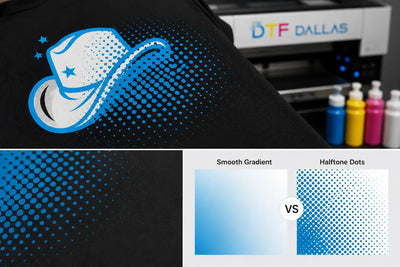
A halftone in DTF printing uses solid dots and open spaces to simulate continuous tones. Darker areas contain larger or more closely spaced dots, while lighter areas contain smaller or more widely spaced dots.
From a normal viewing distance, the eye blends the pattern together and sees a gradient, shadow, or fade. Up close, the individual dots become visible.

Halftones are commonly used for:
- Gradients
- Soft shadows
- Vintage fades
- Distressed textures
- Smoke effects
- Photo-style shading
- Large tonal graphics
The final appearance is influenced by settings such as frequency, angle, and dot shape. Frequency is measured in lines per inch (LPI), and a value in the roughly 45 to 65 LPI range is a common starting point for DTF, since very fine dots can fill in or disappear on film and fabric. Treat any number as a test point, not a fixed rule. There is no single combination that works equally well with every printer, film, RIP, powder, garment, and heat press setup. Testing is still necessary before production.
Why Are Halftones Used in DTF Printing?
Halftones are used in DTF printing to convert fades, shadows, and other tonal effects into a defined pattern of solid dots. This can make tonal artwork easier to review and test than untreated semi-transparent pixels.
Some effects look smooth on a computer screen but behave differently once white ink, adhesive powder, heat, and fabric are involved. Soft transitions often contain partially transparent pixels that may create uncertain results during production.
A halftone replaces those opacity levels with a clearer structure. A printed dot is either present or the space remains open.
How Do Halftones Help With Gradients and Fades?
Halftones can make gradients and fades more controlled by replacing partial transparency with a visible dot pattern. This is especially useful when artwork contains low-opacity edges that may otherwise create haze, fringe, or uneven fading.
Untreated transparency may lead to:
- White halos
- Cloudy edges
- Patchy color
- Rough transitions
- Faint areas that disappear
- Unexpected white underbase
- A print that does not match the screen preview
Halftoning does not guarantee a perfect result. Some files only need better edge cleanup. The goal is to avoid leaving questionable transparency in the artwork without checking how it will reproduce.
Can Halftones Reduce Heavy Ink Coverage?
Halftones can reduce uninterrupted ink coverage by leaving open space between the printed dots. This may help selected areas feel lighter than the same artwork printed as a solid block.
This can be useful for:
- Large back prints
- Oversized vintage graphics
- Broad shadow areas
- Tonal illustrations
- Designs with large faded sections
- Artwork with wide shaded backgrounds
The finished feel also depends on the white underbase, adhesive powder, curing, pressing, and garment fabric. A halftone may reduce density, but it does not automatically guarantee a soft print.
When Should You Use Halftones in DTF Artwork?
Use halftones in DTF artwork when the design depends on gradual tonal transitions, such as gradients, shadows, smoke, faded edges, distressed textures, or photo-style shading. Keep sharp text, logos, QR codes, and thin outlines solid.
Gradients
Color or opacity transitions may benefit from being converted into an intentional dot pattern.
Soft Shadows
Drop shadows and dimensional shading often include faint edge pixels that may be difficult to reproduce consistently.
Smoky or Faded Edges
A halftone can create a controlled fade-out effect without leaving a cloud of low-opacity pixels around the design.
Vintage and Distressed Artwork
Dot patterns naturally support worn, retro, and distressed visual styles.
Photo-Style Shading
Halftones can simplify tonal detail into a structure that can be reviewed and test printed.
Large Tonal Areas
A large solid section may look or feel dense. Halftoning selected portions can reduce uninterrupted coverage while preserving the overall design.
Use halftones for tonal transitions. Keep edge-critical elements solid.
Which Parts of DTF Artwork Should Stay Solid?
Small text, QR codes, thin outlines, fine line art, and important logos should usually remain solid in DTF artwork. These elements depend on sharp edges and clear detail, which can be weakened when they are broken into dots.
Solid artwork is usually the safer choice for:
- Small text
- QR codes
- Thin outlines
- Fine line art
- Tiny logos
- Crisp borders
- Small decorative details
- Important brand elements
Small letters and fine details may lose clarity when converted into a halftone. The smallest dots may also disappear, fill in, or transfer unevenly.
A better approach is to halftone only the gradients, shadows, and faded areas while keeping critical details solid.
Are Halftones Better Than Semi-Transparent Pixels for DTF?
Halftones are often more predictable than untreated semi-transparent pixels when a DTF design depends on fades or tonal shading. Halftones use solid dots and open spaces, while semi-transparent pixels rely on partial opacity that may create halos, cloudy edges, or inconsistent white underbase behavior.
| Semi-Transparent Pixels | Halftones |
|---|---|
| Use partial opacity | Use solid dots and open spaces |
| May create uncertain white underbase behavior | Create a defined printable structure |
| Can produce halos or cloudy edges | Allow more deliberate tonal control |
| May change during production | Can be evaluated through test printing |
| Can be difficult to notice in the file | Can be inspected at final print size |
Halftoning is not always the only solution. If a file contains minor fringe or unwanted low-opacity pixels, cleaning the artwork may be enough.
The important step is to inspect transparency instead of assuming that anything that looks smooth on screen will print the same way.
Do Halftones Make DTF Prints Feel Softer?
Halftones can make some DTF prints feel lighter by reducing solid ink coverage and leaving open space between the printed dots. The result depends on the density of the pattern and the rest of the production process.
A print may still feel dense when:
- The dot pattern is very tight
- The design contains other large solid areas
- The white underbase is heavy
- Too much adhesive powder is used
- The transfer is cured or pressed incorrectly
- The garment fabric is very lightweight
Halftones are one tool for managing coverage. They should not be treated as a guaranteed softness setting.
Can Halftones Make DTF Prints More Breathable?
Halftones can improve airflow compared with a large, uninterrupted solid print because some fabric remains uncovered between the dots. The difference depends on how open or dense the pattern is.
This can be useful for:
- Oversized graphics
- Large back prints
- Sports shirts
- Event apparel
- Warm-weather garments
- Designs with broad shaded areas
A dense halftone may still cover most of the fabric. A more open structure may feel lighter, but it must still preserve enough detail to reproduce the intended artwork.
How Do You Prepare Halftones for DTF Printing?
Prepare halftones for DTF printing by finalizing the design, cleaning unwanted transparency, selecting only the tonal areas, keeping important details solid, and testing the file at its final print size.
1. Finish the Design
Confirm the size, colors, text, placement, and layout before creating the halftone. Making major edits after halftoning can be more difficult.
2. Clean the Artwork
Check the file for:
- Faint edge residue
- Stray pixels
- Low-opacity areas
- White or dark halos
- Background contamination
Artwork cleanup should happen before effects are applied.
3. Select the Tonal Areas
Identify the gradients, shadows, faded textures, smoke effects, or photo shading that need halftoning. Avoid applying the effect to the entire design without a clear reason.
4. Keep Important Details Solid
Preserve text, logos, QR codes, thin outlines, and other edge-critical elements as solid artwork.
5. Test at the Final Print Size
A halftone that looks smooth while zoomed in may behave differently at the intended print dimensions.
Print a test and check whether:
- The smallest dots remain visible
- Faded areas hold their shape
- Text stays readable
- Dots fill in during pressing
- Dots disappear after washing
- The tonal balance still looks correct
The most useful test uses the same film, powder, curing, pressing, and garment conditions planned for the final order.
Once the file is finalized, use the DTF Gang Sheet Builder to arrange multiple print-ready designs efficiently on one sheet.
What Are the Most Common DTF Halftone Mistakes?
The most common DTF halftone mistakes are starting with dirty artwork, applying dots to every element, halftoning small text, relying only on the screen preview, and skipping a physical test.
Starting With Dirty Artwork
Halftoning does not remove stray pixels, contaminated edges, or unwanted transparency. It can make those problems more noticeable. Clean the file first.
Applying Halftones to Everything
Flat colors, bold text, sharp logos, and clean vector shapes usually do not need a dot pattern. Use halftones only where they solve a specific tonal or coverage problem.
Halftoning Small Text
Small text and thin lines may become harder to read when converted into dots. Keep important details solid.
Relying Only on the Screen Preview
A monitor cannot fully predict how the artwork will behave on film, fabric, or after pressing. Review the file at its actual print size and test the physical output.
Skipping the Test Print
Film, powder, printer condition, press settings, garment fabric, and artwork size can all affect the finished transfer. Testing is especially important for detailed artwork and larger production runs.
Does Every DTF Design Need Halftones?
Not every DTF design needs halftones. Artwork made from solid colors, bold text, clean logos, and sharp vector shapes can often be printed without a halftone pattern.
Halftones are most useful when they solve a specific issue, such as:
- Replacing risky semi-transparency
- Creating a controlled fade
- Reducing heavy tonal coverage
- Reproducing photo-style shading
- Supporting a vintage or distressed look
A halftone should improve the file. It should not be added only because the effect looks technical.
Final Thoughts
A DTF halftone converts gradients, shadows, faded edges, and other tonal effects into a defined pattern of solid dots and open spaces. It can also reduce uninterrupted ink coverage in selected parts of a design.
Good results still depend on clean artwork, solid critical details, suitable settings, and physical testing.
The best halftone is not the one that looks most dramatic on a screen. It is the one that holds its detail, prints consistently, and works with the garment and production process.
Frequently Asked Questions
What is a halftone in DTF printing?
A halftone in DTF printing is a pattern of solid dots and open spaces used to create the appearance of gradients, shadows, fades, and tonal shading. Darker areas use larger or denser dots, while lighter areas use smaller or more widely spaced dots. Review the pattern at its final print size before production.
Why are halftones used in DTF printing?
Halftones are used in DTF printing to convert gradients, shadows, and faded areas into a defined dot structure instead of relying on uncontrolled semi-transparent pixels. This makes tonal artwork easier to inspect and test. Keep text, logos, QR codes, and thin outlines solid unless the design specifically requires a halftone effect.
Do halftones make DTF prints feel softer?
Halftones can make some DTF prints feel lighter by reducing solid ink coverage and leaving open space between the printed dots. The final feel also depends on the white underbase, powder, curing, pressing, garment fabric, and density of the pattern. Test the design on the intended garment before a large production run.
Can halftones make DTF prints more breathable?
Halftones can improve airflow compared with a large, uninterrupted solid print because some fabric remains uncovered between the dots. The difference depends on how open or dense the pattern is. For oversized front or back graphics, compare a halftoned test print with a solid version before choosing the final artwork.
Should text and logos be halftoned for DTF printing?
Small text, QR codes, thin lines, and important logos should usually remain solid in DTF artwork because halftoning can reduce edge clarity and readability. Halftones are better suited to gradients, shadows, distressed textures, and photo-style shading. Keep edge-critical elements solid and apply the dot pattern only where tonal transition is needed.
Can semi-transparent pixels be used instead of halftones in DTF artwork?
Semi-transparent pixels can cause white halos, cloudy edges, patchy color, or inconsistent white underbase behavior in DTF printing. A controlled halftone may provide a more defined structure for fades and shadows. Clean unwanted transparency first, then test the artwork at its final print size before production.
Ready to Print Your Artwork?
Order custom DTF transfers from DTF Dallas with no minimum order. Qualifying orders placed by 2:00 PM CST are eligible for same-day turnaround, and customers can use 24/7 pickup in Richardson, Texas.
DTF Dallas
903 N Bowser Rd Suite 250, Richardson, TX 75081
Phone: +1 (469) 769-8949
Email: info@dtfdallas.com
Same-day shipping cutoff 2:00 PM CST. 24/7 pickup. Free shipping on orders $100+.
Comments 0
Be the first to leave a comment.