The Art of the Pocket Print and Creative Placement with Ready-to-Press Designs
Dec 8, 2025 (Updated on Dec 12, 2025)
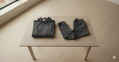
For decades, the graphic tee has been defined by a simple formula: a bold, captivating image placed squarely in the center of the chest. It’s a classic for a reason—it’s direct, impactful, and easy to execute. But in the crowded and sophisticated apparel market of 2025, brands that are truly pushing the envelope are looking beyond this traditional canvas. They understand that a T-shirt is not just a flat rectangle; it’s a three-dimensional garment with geography, nuance, and untapped potential. The mark of a modern, thoughtful apparel brand is no longer just the quality of the graphic, but the creativity of its placement.
This is where the art of the pocket print, creative placement, and layering comes into play. These are not just design techniques; they are a statement of intent. They signal to the customer that every detail has been considered, transforming a simple piece of clothing into a curated, premium product. A small, witty icon on the pocket, a surprise graphic on the back of the neck, or a story told through a series of prints down a sleeve—these are the details that create intrigue, spark conversations, and justify a higher price point. They are what separate a generic merch item from a piece of beloved apparel.
For entrepreneurs and small business owners, mastering these techniques is the key to elevating your brand. Thanks to the incredible precision and versatility of modern DTF transfers, executing these advanced placements is more accessible than ever before. You don't need a massive screen printing setup to achieve a retail-ready look. You just need a vision and a partner like DTF Dallas to provide the flawless prints to bring it to life. It’s time to think outside the center chest box and explore the vast creative territory of your apparel.

Mastering the Power of the Pocket Print
The single most effective step away from the standard graphic tee is the embrace of the pocket print. It’s a small detail that carries a disproportionate amount of style and sophistication. A design placed on the left chest (often called the "pocket area," even on shirts without a physical pocket) instantly changes the character of a garment, making it more subtle, versatile, and thoughtful.
A Legacy of Understated Cool
The pocket print has a rich history, rooted in both utility and subculture. It began as a purely functional element on workwear, a place for brand logos on polo shirts and uniforms. However, it was co-opted by preppy and Ivy League styles in the mid-20th century as a mark of quiet affiliation. By the 80s and 90s, skate and streetwear culture had adopted it, turning the subtle placement into a canvas for ironic, edgy, and clever iconography. This unique history is why the pocket print feels simultaneously classic and modern, capable of conveying a wide range of attitudes from polished and professional to witty and rebellious.
The Psychology of a Subtle Statement
Why is this small placement so powerful? It’s because it operates on a different psychological level than a large chest graphic. A big, bold print is a proclamation, meant to be seen and understood from across the room. A pocket print is a conversation starter. It invites closer inspection. It’s a detail that might not be noticed at first, rewarding observers who pay attention. This subtlety makes a garment feel more personal to the wearer and more intriguing to the viewer. A shirt with a small, clever icon over the heart can be worn in far more social settings than one with a giant skull on the front, broadening its appeal and utility.
Choosing the Perfect Pocket-Sized Design
Not every design is suited for a 3- to 4-inch space. The key to an effective pocket print is clarity and immediate readability.
- Simplicity is King: The best pocket prints are often simple icons, symbols, or logos. Complex scenes with multiple elements will become an unreadable mess when shrunk down. Think bold lines and distinct shapes.
- Iconography and Wit: This is the perfect canvas for a single, witty icon that represents your brand's ethos. Examples include a stylized coffee cup for a cafe-themed brand, a simple flower or plant for a nature-inspired line, or a clever, minimalist skull for an edgy streetwear vibe.
- Text as a Graphic: Short words or acronyms can work beautifully, but the font must be clean and bold. A simple, well-designed monogram or a three-letter acronym can look incredibly sharp. Avoid long words or complex script fonts.
The Technical Side of Perfect Placement
Consistency and precision are what make a pocket print look professional. While there is some artistic leeway, adhering to industry standards is the best starting point.
- Standard Placement: The general rule for an adult T-shirt is to place the center of the design approximately 7 to 9 inches down from the shoulder seam, where it meets the collar. Horizontally, the centerline of the design should align roughly with the inside edge of the collar.
- Using a Physical Pocket as a Reference: On a shirt with a real pocket, you typically want the design to be printed directly on the pocket. If you are printing above it, leave about a half-inch of space.
- Consistency Across Sizes: This is a major challenge. The 9-inch-down rule that looks perfect on an Extra Large will look far too low on an Extra Small. It's crucial to create placement guides for different size ranges (e.g., XS-S, M-L, XL-XXL) to maintain a visually consistent look across your entire product line. Using a T-shirt alignment tool or creating your own cardboard templates can be a lifesaver for ensuring every single shirt in a batch is pressed perfectly.
Exploring Creative Placements Beyond the Pocket
Once you've mastered the pocket print, you can begin to see the entire garment as your canvas. Creative placement is all about using the geography of the shirt to your advantage, creating surprise, adding value, and developing a unique brand identity.
The Visual Power of Asymmetry
Our brains are wired to notice things that break a pattern. A perfectly centered design is symmetrical and stable. By moving a design element off-center, you create a sense of dynamic visual tension that is inherently more interesting and modern. It guides the viewer's eye around the garment and creates a more sophisticated composition.
High-Impact Locations for Your Next Design
Here are some of the most effective and underutilized placements that can set your brand apart.
- The Classic Sleeve Hit: Placing a small graphic on the sleeve is a classic way to add a secondary branding element. This is perfect for a small brand logo, an iconic symbol, or a simple word. Placement on the bicep area is common for short sleeves, while placement on the cuff is ideal for long-sleeved shirts. It’s a subtle touch that adds a layer of authenticity and detail.
- The Upper Back Yoke: The area on the back of the shirt, just below the collar, is prime real estate for a "surprise" element. This is the perfect spot for your brand's name, a small logo, or a witty phrase. It’s a detail that is often seen when the wearer is walking away, leaving a lasting impression. It mimics the placement of tags on high-end designer apparel, which subtly elevates the perceived quality of your product.
- The Unexpected Hem Tag: One of the most professional-looking placements is a small design printed near the bottom hem of the shirt, often on the front left side. This is where many retail brands place a small woven tag with their logo. With DTF transfers, you can replicate this high-end feel with a simple, small print. It’s a subtle detail that signals a deep attention to craftsmanship.
- The Bold Side Wrap: For a truly dynamic and eye-catching look, consider a design that wraps around the side of the body. This involves placing a larger graphic so that it starts on the front of the shirt and continues around the side seam to the back. This technique works best with organic or abstract designs, like floral vines, paint splatters, or geometric patterns that can be interrupted by the seam without losing their impact.
Matching the Design to the Location
The success of these creative placements depends on choosing the right graphic for the right spot. A long, vertical design, like a word or the stem of a flower, is perfectly suited for a sleeve. A small, contained circular or square logo is ideal for the back yoke or hem. Always consider the shape of the area you are printing on and how the garment will drape and move when worn.
The Art of Layering and Composition
The final frontier of advanced placement is layering—using multiple, separate prints to create a single, cohesive, and narrative-driven garment. This is not about pressing transfers on top of one another, but about arranging them across the shirt to create a deliberate composition. This technique allows you to build depth, tell a story, and create a truly unique, high-value product.
Creating a Visual Narrative
Layering turns a T-shirt into a multi-part story. By placing different design elements in different locations, you encourage the viewer to look at the entire garment, discovering new details from every angle. This transforms the shirt from a simple graphic carrier into an interactive piece of art.
Effective Layering Formulas
While the possibilities are endless, there are a few classic formulas that serve as a great starting point for creating layered compositions.
- The "Pocket & Back" Combo: This is the most popular and commercially successful layering technique. It involves a small, simple logo or icon on the front left chest, which serves as a subtle introduction to the brand. On the back, you place a large, explosive, and highly detailed graphic that is thematically related to the front print. This formula gives you the best of both worlds: understated style from the front and a bold statement piece from the back.
- The Storytelling Sleeve: This technique uses the long canvas of a sleeve on a long-sleeved tee or sweatshirt to tell a story. You can press a series of small, related icons in a sequence down the arm. For example, a sleeve could feature the different phases of the moon, the life cycle of a plant, or a series of symbols that represent a journey.
- The "Controlled Chaos" Collage: This is a bold, maximalist approach popular in streetwear. It involves arranging multiple, seemingly unrelated transfers—text, small icons, photo-realistic images—across the front of the shirt to create a busy, energetic collage. The key to making this work is to maintain a consistent color palette or theme to prevent the design from looking truly random.

Technical Tips for Multi-Press Applications
Pressing multiple transfers onto a single garment requires care and precision to avoid damaging the prints you’ve already applied.
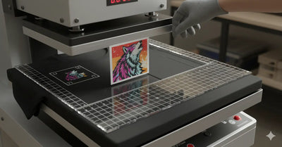
- Protect Your Prints: Always use a Teflon sheet or a piece of parchment paper to cover any transfers that have already been pressed onto the shirt. This prevents the exposed ink from coming into direct contact with the hot upper platen of your heat press, which can cause it to become sticky or smudged.
- Mind the Seams and Collars: When pressing designs in unconventional locations like near the hem or on the sleeve, be extra careful that thick seams or the collar are not under the heat press platen. Uneven pressure is a leading cause of application failure. Use a heat pressing pillow or a mouse pad placed inside the shirt to raise the printing area, ensuring even pressure across the transfer.
Advanced Placement and Print Queries
-
How do I ensure my unique placements are consistent across an entire batch of shirts?
- Consistency comes from creating templates. For sleeve or hem placements, you can use a ruler and a heat-erasable fabric marker to make small guide marks. For more complex placements, creating a full-size paper template of the shirt that you can lay your transfers on before pressing is the most effective method for ensuring every shirt is identical.
-
Will placing a large print on the side of a shirt feel strange or stiff to wear?
- This is where the quality of your DTF transfers is crucial. High-quality DTF prints are incredibly thin, soft, and flexible. Unlike thick, old-school screen prints, they stretch with the fabric. While a very large side-wrap print might be slightly noticeable, it shouldn't feel stiff or uncomfortable if the transfer is of good quality.
-
Are there any placements to completely avoid?
- It's generally best to avoid printing directly over a seam, as the uneven surface makes it nearly impossible to get the even pressure needed for a successful application. Armpit areas are also typically avoided due to high friction and moisture. Ultimately, the only real limitation is your ability to create a flat, even surface for the heat press.
Comments 0
Be the first to leave a comment.