If you've ever stood in an art gallery and admired a stunning, vibrant oil painting on a dark-colored canvas, you've witnessed a secret that artists have known for centuries: to make colors truly pop, you first need a solid, bright foundation. Before applying the rich colors, a painter will often coat their dark canvas with a layer of white gesso primer. This neutral base prevents the dark canvas from dulling the colors and allows the pigments to shine with their true, intended vibrancy.
In the technologically advanced world of Direct-to-Film printing, we have our own version of this artistic secret weapon. It's the often-overlooked but critically important "W" in the CMYK+W color model: the white ink layer.
While the brilliant cyan, magenta, yellow, and black inks get all the glory for creating your beautiful designs, it is the humble white ink that does the heavy lifting behind the scenes. It is the silent hero, the foundational primer, and the structural backbone of every professional DTF transfer you create.
Understanding and mastering the white ink layer is arguably the single most important skill that separates a beginner from an expert DTF operator. It's the key to unlocking eye-popping vibrancy on dark garments, ensuring bulletproof durability in the wash, and controlling the final feel of your print. This is your deep dive into the undisputed MVP of the DTF process.
The Model
The Basics Revisited: What is CMYK+W?
Before we can appreciate the role of white ink, let's quickly solidify our understanding of the entire color model used in DTF printing.
A Quick Look at CMYK
CMYK stands for Cyan, Magenta, Yellow, and Key (Black). This is the standard "subtractive" color model used in almost all forms of printing. The printer starts with a white surface (like paper) and applies tiny dots of these four colored inks. The inks "subtract" or absorb certain wavelengths of light, and the light that reflects back to our eyes creates the illusion of millions of different colors. In this model, the "white" in a design is simply the absence of ink, the white of the paper showing through.
Introducing the "W": The DTF Superpower
In DTF printing, we add a fifth, crucial channel: "W" for White. This is not the absence of ink; this is a physical, highly opaque layer of pigmented white ink. The presence of this fifth channel is what elevates a DTF printer into a textile-decorating powerhouse and is the primary reason for its incredible versatility.
Unlike printing on paper, our canvas is rarely white. We're printing for black t-shirts, navy hoodies, red polos, and a rainbow of other colored fabrics. The "W" in our process is what makes this possible. It allows us to create our own bright white canvas on any colored surface, ensuring our designs look just as brilliant on a black shirt as they do on a white one.
Three Jobs, One Layer
The Three Critical Roles of the White Ink Layer
The white ink layer isn't just a simple background. It performs three distinct, vital functions simultaneously. Understanding each role will give you a profound appreciation for its importance and show you how to manipulate it for better results.
Role 01 / The Digital Primer
The Foundation of Vibrancy
This is the most intuitive and visually obvious role of the white ink. As we mentioned with the art gallery analogy, the white ink layer acts as a digital primer or an underbase.
Imagine trying to color with a yellow marker on a piece of black construction paper. The yellow will look dark, dull, and muddy because the black paper absorbs most of the light, preventing the yellow pigment's true color from reflecting back to your eye.
The exact same thing would happen if you printed CMYK inks directly onto a black t-shirt. The cyan would look navy, the yellow would look olive green, and the entire design would be a dull, lifeless mess.
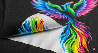
The DTF process solves this by first laying down a precisely shaped layer of opaque white ink onto the transfer film. The CMYK color inks are then printed directly on top of this white layer. When you press this transfer onto the black t-shirt, the white ink layer sits between the dark fabric and your colored design. It creates a vibrant, neutral canvas that allows the CMYK inks to show their true, brilliant colors, completely unaffected by the dark garment underneath.
This function is also what allows you to have the color white as a part of your actual design, something that is impossible in many traditional printing processes that rely on the paper for white.
Role 02 / The Anchor
The Bridge for Adhesion
This is the structural role of the white ink layer, and it is absolutely critical for the durability of your transfer. Let's walk through the physical layering of a DTF transfer:
- Your DTF printer first prints the CMYK color layer onto the PET film.
- Next, it prints the white ink layer directly on top of the wet CMYK inks.
- The transfer then moves to the powdering stage, where the adhesive powder is applied.
Crucially, the adhesive powder sticks to the final wet layer of ink, which is the white ink. This means the white ink acts as the physical "bridge" or "anchor" that connects the color part of your design to the heat-activated adhesive.
The entire strength and durability of your final print depends on this bond. If your white ink layer is too thin, inconsistent, or poorly cured, the adhesive powder won't have a solid foundation to cling to. This can lead to parts of the transfer not sticking to the garment during pressing, or, even worse, the design cracking and peeling away after just a few washes. A strong, consistent white ink layer is the foundation of a long-lasting, professional-quality print.
Role 03 / The Body
The Control for Hand-Feel and Durability
The final role of the white ink layer is one that gives you, the operator, a surprising amount of creative control over the final product's characteristics. The amount of white ink you use directly impacts both the feel and the durability of the transfer.
A Thicker White Layer
Using a higher percentage of white ink will create a more opaque, robust, and durable transfer. It will stand up to more stretching and washing. However, this extra body comes at a cost: a heavier "hand-feel." The print might feel thicker and less integrated with the fabric, which may not be desirable for fashion-focused apparel.
A Thinner White Layer
Using less white ink will result in a transfer that is significantly softer, lighter, and more breathable. It will have a much softer "hand-feel" that is highly desirable for vintage-style prints or designs on thin, soft garments. The trade-off is that it will be slightly less opaque and potentially less durable over the long term compared to a thicker print.
Neither of these is "right" or "wrong." They are simply different tools for different jobs. Mastering the control of your white ink output allows you to tailor your prints to the specific needs of your client and the garment you're printing on.
The Controls
Mastering the White Layer: How RIP Software Gives You Control
So, how do you actually control this all-important layer? You don't have to manually create a white shape in your design software. This entire complex process is managed automatically by your RIP software.
RIP stands for Raster Image Processor, and it is the true brain of your DTF operation. It takes your standard design file (like a PNG) and intelligently generates the print instructions for both the CMYK and the W channels. Understanding the white ink settings in your RIP is the key to mastering your final output.
Key White Ink Settings in Your RIP (and What They Mean)
While the specific names may vary slightly between RIP programs (like AcroRIP or CADlink), the core concepts are universal.
01White Ink Density / Percentage
This is your master control for the overall amount of white ink being used. It's the setting you'll adjust most often.
-
100% White Use this for standard prints on black or very dark garments where maximum opacity and vibrancy are the goals. This will create a solid, bright foundation.
-
60% to 80% White This is a great range for creating a softer, slightly less opaque print on colored or heathered garments. It can produce a popular "vintage" or "faded" look where a bit of the fabric texture shows through, and it results in a much softer hand-feel.
-
Under 50% White This can be used for artistic effects or for printing on white garments where you only need a very light white base to help with adhesion, but not for opacity.
02Choke / Spread
This is a more advanced setting that solves a common printing problem: the dreaded "white halo." Sometimes, a tiny sliver of the white underbase can peek out from behind the edges of your color layer. A "choke" setting tells the RIP to make the white underbase layer just a few pixels smaller than the color layer. This ensures the color layer completely covers the white, resulting in crisp, clean edges with no white halo. The default is usually a 1-2 pixel choke.
03Gradient / Highlight Control
This is an intelligent feature in most professional RIPs. The software is smart enough to know that it doesn't need to put a full 100% white base under a light yellow color, but it does need 100% white under a deep, rich black. The RIP automatically varies the amount of white ink it puts down based on the color information in the design. It puts more white under dark, saturated colors and less white under light, pastel colors. This brilliant process saves a significant amount of expensive white ink and dramatically improves the overall hand-feel of the print by reducing the ink load in lighter areas.
By experimenting with these settings and creating custom profiles in your RIP software, you can gain precise control over the look, feel, and durability of every single print you produce.
Questions
White Ink Questions, Answered
Why does DTF printing need white ink?
DTF printing needs white ink because the garment is rarely white, and CMYK inks printed straight onto a dark shirt look dull and muddy. The white layer creates an opaque, neutral canvas between the fabric and the color layer so cyan reads as cyan instead of navy. Every DTF Dallas transfer is printed with this underbase built in.
What does the W in CMYK+W stand for?
The W stands for White, a fifth ink channel added alongside Cyan, Magenta, Yellow, and Key (Black). Unlike paper printing where white is simply the absence of ink, this W is a physical layer of highly opaque pigmented white ink. It is what lets DTF Dallas print a full-color design on a black hoodie as brightly as on a white tee. Order your DTF transfers by size to see it in practice.
Can you print DTF transfers without white ink?
You can skip or heavily reduce white ink only when printing on white or very light garments, where opacity is not needed. On colored or dark fabric the design loses vibrancy without it, and the adhesive powder also loses the layer it bonds to. Because the powder sticks to the final wet white layer, removing white ink weakens the whole transfer. Build your sheet with the DTF Dallas gang sheet builder.
What is a white halo on a DTF transfer?
A white halo is a thin sliver of the white underbase peeking out from behind the edges of the color layer. RIP software fixes it with a choke setting, which shrinks the white layer by a pixel or two so the color completely covers it, giving crisp edges. The default is usually a 1-2 pixel choke. DTF Dallas handles this calibration before your transfer prints.
How does white ink density affect the feel of a print?
White ink density controls both opacity and hand-feel. A thicker white layer at 100% gives maximum opacity and durability on dark garments but a heavier feel, while 60% to 80% produces a softer, slightly faded vintage look with a lighter hand. Neither is right or wrong, they suit different garments and design goals. Start a run with DTF Dallas gang sheets.
Why does the adhesive powder stick to the white layer?
The adhesive powder sticks to the white layer because white is printed last, on top of the wet CMYK inks, so it is the final wet surface when the transfer reaches the powdering stage. This makes the white ink the physical anchor connecting your artwork to the heat-activated adhesive. A thin or poorly cured white layer is the most common cause of transfers cracking or peeling after a few washes.
Wrap Up
Embrace the "W" to Elevate Your Craft
In the DTF formula of CMYK+W, it's easy to focus on the four colors that create the image. But the true craft and control lie in understanding the "W." The white ink layer is the unsung hero that provides the foundation for vibrancy, the anchor for adhesion, and the body that defines the feel and durability of your work.
To move from simply printing designs to truly engineering professional-grade transfers is to embrace the power of the white layer. Learn the settings in your RIP software. Experiment with different ink densities on different fabrics. Understand that you are not just a printer; you are a technician with the power to control every aspect of the final product.
When you master the white ink, you master the art of DTF. You gain the ability to produce consistently brilliant, incredibly durable, and perfectly tailored prints that will set your business apart from the competition.