
Creating a Brand Kit for Your T-Shirt Business
Sep 2, 2025 (Updated on Oct 28, 2025)
You’ve done the hard work. You’ve honed your craft, invested in a high-quality DTF printer, and are creating t-shirts with incredible, eye-catching designs. Your products are top-notch. But when you look at your business as a whole—your Instagram feed, your website, your product packaging, your market stall—does it all feel… a little disconnected?
Maybe you use a slightly different logo on your social media than on your website. Maybe you eyeball your brand’s main color, leading to a dozen different shades of "blue" across your marketing materials. Maybe your font choices change depending on your mood that day.
This small level of chaos is a classic sign of a business that has great products but lacks a strong brand identity. And in the crowded world of custom apparel, a strong brand identity is what separates a fleeting hobby from a thriving, memorable business.
The solution? You need a Brand Kit.
This isn't some complex, corporate document reserved for mega-brands. A brand kit is your business's North Star—a simple, powerful rulebook for your entire visual identity. It’s the secret weapon that ensures consistency, builds customer trust, and makes you look like the professional, serious business you are. Let's dive into what a brand kit is, why it's non-negotiable, and how to build one for your t-shirt business.
What is a Brand Kit, Really? (And Why You Absolutely Need One)
A brand kit, also known as a brand style guide, is a centralized document that defines all the essential visual and verbal elements of your business. It's much more than just your logo. It's the DNA of how your brand looks, feels, and communicates with the world, everywhere, every single time.
Think of it as the official instruction manual for your brand’s personality. If you were to hire a new social media manager or a freelance designer, you could hand them your brand kit, and they would instantly understand how to create materials that look and sound like they came directly from you.
The Core Benefits: Consistency, Efficiency, and Professionalism
Investing the time to create a brand kit pays off in three massive ways:
- Consistency Builds Trust and Recognition: When your brand looks the same on your website, your Instagram, your packaging, and your product tags, it creates a cohesive and seamless experience for your customers. This consistency makes your brand instantly recognizable and signals that you are professional, reliable, and trustworthy. People trust what they recognize.
- Efficiency Saves You Precious Time: How much time do you waste searching for the right hex code for your brand’s primary color? Or trying to remember which font you used on your last promotional graphic? A brand kit eliminates this guesswork entirely. It's a single source of truth that allows you to create new marketing materials, social media posts, and product mockups with incredible speed.
- Professionalism Attracts Better Customers (and Justifies Higher Prices): A business with a strong, consistent brand identity looks established, confident, and serious. This professional image builds perceived value. Customers are more willing to pay a premium for a t-shirt from a brand that feels polished and legitimate than from one that looks like a scattered hobby.
The 5 Essential Elements of Your T-Shirt Brand Kit
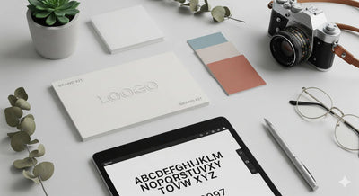
A comprehensive brand kit doesn't need to be 100 pages long. For a t-shirt business, it can be a simple, one-page document that covers these five critical areas.
Element 1: Your Logo Suite
Your brand needs more than just a single logo file. A "logo suite" provides you with versatile versions of your logo to use in any situation, ensuring it always looks great.
- Primary Logo: This is your main, go-to logo. It’s the most detailed version and should be used whenever space allows, like on your website header.
- Secondary Logo (or Alternate Mark): This is a simplified or rearranged version of your primary logo. For example, if your primary logo is wide and horizontal, your secondary logo might be a stacked, more compact version. This is perfect for situations where the primary logo doesn't fit well.
- Submark (or Icon): This is the simplest, most graphic element of your logo, stripped of any extra text. It’s perfect for use as a social media profile picture, a website favicon, or even as a small icon on your packaging or printed neck tags.
Pro-Tip: Make sure you save each of these logos in different file formats (like .PNG for transparent backgrounds on the web, and .SVG or .EPS vector files for high-quality printing) and in different color variations (full color, all-black, and all-white).
Element 2: Your Color Palette
Color is a powerful tool for evoking emotion and creating brand recognition. Your color palette should be used consistently across every single touchpoint of your brand.
- Primary Colors (1-3 colors): These are the main colors your brand is known for. They should be used most frequently in your logo, on your website, and in your marketing.
- Secondary Colors (2-4 colors): These are complementary or accent colors used to provide contrast, highlight information (like a "Buy Now" button), and add visual interest.
- Neutrals (1-3 colors): These are essential for backgrounds and text. Think black, white, and a few shades of gray or beige.
Pro-Tip: For each color, record its HEX code (for web use, e.g., #4A90E2), RGB code (for digital use), and CMYK code (for print use). This guarantees your brand’s signature blue looks the exact same on screen as it does on your printed business cards.
Element 3: Your Typography Hierarchy
Just like colors, your fonts (typography) communicate a specific personality. Using them consistently is key. You should define a clear hierarchy.
- Headline Font: This is your main, most expressive font. It should be used for titles and headers to grab attention. It can be bold and full of personality.
- Sub-headline Font: A complementary font that’s a bit simpler than your headline font. It's used for secondary text that supports the main title.
- Body Font: This font must be, above all, clear and legible. It's used for paragraphs and longer blocks of text on your website or in emails. Simple, clean sans-serif fonts are a popular choice here.
Pro-Tip: Google Fonts offers a massive library of high-quality, free-for-commercial-use fonts. You can find beautiful font pairings there without spending a dime.
Element 4: Imagery and Photography Style
How you present your t-shirts is a huge part of your brand. Your brand kit should include guidelines for your visual aesthetic.
- Product Mockups: Define how your products should be displayed. Are you a minimalist brand that uses clean, simple flat lays on a neutral background? Or are you a lifestyle brand that uses dynamic photos of models in real-world, urban environments? Choose a style and stick with it.
- Social Media Photography: Define the mood and editing style of your photos. Is your brand bright and airy? Dark and moody? Warm and vintage? Using a consistent set of photo editing presets (like those in Adobe Lightroom) is a great way to maintain a cohesive look on your Instagram feed.
Element 5: Your Brand Voice
Branding isn't just about what people see; it's also about what they read and hear. Your brand voice is the personality that comes through in your writing.
- Define Your Personality: Write down 3-5 adjectives that describe your brand. Is it witty and sarcastic? Inspiring and motivational? Edgy and rebellious? Casual and friendly?
- Keywords and Phrases: List words and phrases to use and to avoid. For example, you might want to use words like "premium," "handcrafted," and "bold," while avoiding corporate jargon like "synergy" and "utilize." This guide will help you write website copy, product descriptions, and social media captions that all sound like they come from the same person.
How to Build and Use Your Brand Kit
Creating your brand kit doesn't have to be complicated.
- Tools for Creation: You can build a beautiful and functional brand kit using a variety of tools. Canva has a fantastic "Brand Kit" feature that allows you to save your logos, colors, and fonts for easy access. You could also use Adobe Illustrator to create a professional one-page PDF, or even just a well-organized Google Doc or Slide presentation. The tool doesn't matter as much as the content.
-
Putting It Into Practice: Once your brand kit is created, use it for everything!
- Build your website using your defined colors and fonts.
- Create a set of social media templates in Canva that use your brand elements.
- Ensure all your product mockups follow your photography guidelines.
- Write your product descriptions and emails in your defined brand voice.
- Use your submark or icon to design custom, DTF-printed neck tags for your shirts, adding a professional touch that elevates your product. Your DTF printing supplies like inks and films are the tools to bring this branding to life.
From T-Shirt Seller to Unforgettable Brand
A brand kit is a foundational document that transforms your business from a simple collection of products into a cohesive and memorable brand. It is a one-time investment of time and thought that will pay dividends for years to come in the form of increased efficiency, customer trust, and a powerful, professional identity.
It ensures that every color you choose, every font you type, and every photo you post is working together to tell the same compelling story. In a world of endless options, a strong brand is what makes a customer choose you, remember you, and come back to you again and again.
💬 Common Questions for Brand Kits
-
Q1: I'm not a designer. Can I still create a brand kit?
- A: Absolutely! Tools like Canva are designed for non-designers and make it very easy to choose colors and fonts that work well together. You can also find pre-made brand kit templates on sites like Etsy or Creative Market that you can customize for your own business.
-
Q2: How much should I expect to pay to have a professional design my brand kit?
- A: Prices can vary wildly depending on the designer's experience and the scope of the project. A basic logo suite and brand kit from a newer freelance designer might start at a few hundred dollars, while a comprehensive branding package from an established agency could be several thousand.
-
Q3: How often should I update my brand kit?
- A: Your core brand kit should be relatively stable. You shouldn't be changing your main logo and colors frequently. However, you can (and should) refresh your brand over time. A "brand refresh" (tweaking your secondary colors or updating your photography style) might be appropriate every 2-3 years, while a full "rebrand" (a major overhaul) is a much bigger undertaking that should only be done for strategic reasons.
Comments 0
Be the first to leave a comment.


